
Thursday, December 10, 2015
Thursday, November 19, 2015
12.11.15 | Reading Assignment 3
Ladislav Sutnar Originally a painter, Sutnar's works have a very deliberately codified and engineered look to them: from company catalogs to brochures, I definitely enjoy the level of consistency, restraint, deliberation in color usage and overall sense of modernism his works employ.
 The cover to Venus illustrates an element of Sutnar's works Graphic Design, Referenced does not: outside of his catalog and brochure works, he has a number of illustrations minimalizing the female form - distilling it as opposed to trivializing it, rather. In this case, the whole package results in an interesting composition: the almost thrifty use of shapes making up the head and hair also nicely space out the page, while the massive type on the left gives it a contemporary, almost early-2000s feel (this was produced in 2011).
Otl Aicher
Aicher's reach generally consisted of graphic work for small corporate entities, and - notably - the 1972 Summer Olympic Games in Munich. His color use is generally cool, especially in his advertisements for the Olympic Games, and his breadth of works pertaining to establishing corporate identity are likewise interesting without feeling overbearing.

This particular pictogram of Aicher's for the 1972 Olympic Games wasn't specifically covered in the book, though the composition overall is incredibly interesting and resourceful; including blacks and whites, it only uses a total of six colors, relying on color theory to provide standout illustrations of minimal "stick figure"-esque illustrations against complementary background colors. The vertical columns dividing up the information give it an almost metropolitan feel, while similarly to Kamekura the illustrations of the figures themselves are expressive and determined, bordering on abstractions with the shooters on the far right.
Cato Partners
Somewhat similarly to Aicher above, Cato Partners, started by Ken Cato, eventually expanded into a wide array of umbrella-corporate locations, albeit with specializations focusing on local partnerships per a given area. With locations in various parts of the eastern and western worlds, design influences are evident while not predominant, fixating mostly on towering human forms in tangible applications. These silhouettes are often integrated into the fixtures of their buildings, rather than appearing alongside them like cut-outs; a certain "tiling" effect gives many of them a sense of depth, having been worked into brick and mortar. Their non-human (read: abstract) works are similarly interesting due to the levels of depth they convey, often making full use of the three dimensions they're presented in.
 The Jiafu logo clearly emphasizes the core tenets of Cato Partners: emphasis on local business as well as an illusory sense of depth and interconnectedness in its illustrations. The type is bold and serves as an effective eye-catcher transcending language barriers. While information is given in both English and Chinese, as it's for a company in a large port town known as Guangzhou, its heavy sans-serif type provides a level of integrity and gravity sure to attract attention. The orange "wall" going partially behind the bolded type is also a nice touch, with the visual of it "streaming through" the logo resembling a sense of lateral movement similar to that found in the FedEx logo.

Otl Aicher
Aicher's reach generally consisted of graphic work for small corporate entities, and - notably - the 1972 Summer Olympic Games in Munich. His color use is generally cool, especially in his advertisements for the Olympic Games, and his breadth of works pertaining to establishing corporate identity are likewise interesting without feeling overbearing.

This particular pictogram of Aicher's for the 1972 Olympic Games wasn't specifically covered in the book, though the composition overall is incredibly interesting and resourceful; including blacks and whites, it only uses a total of six colors, relying on color theory to provide standout illustrations of minimal "stick figure"-esque illustrations against complementary background colors. The vertical columns dividing up the information give it an almost metropolitan feel, while similarly to Kamekura the illustrations of the figures themselves are expressive and determined, bordering on abstractions with the shooters on the far right.
Cato Partners
Somewhat similarly to Aicher above, Cato Partners, started by Ken Cato, eventually expanded into a wide array of umbrella-corporate locations, albeit with specializations focusing on local partnerships per a given area. With locations in various parts of the eastern and western worlds, design influences are evident while not predominant, fixating mostly on towering human forms in tangible applications. These silhouettes are often integrated into the fixtures of their buildings, rather than appearing alongside them like cut-outs; a certain "tiling" effect gives many of them a sense of depth, having been worked into brick and mortar. Their non-human (read: abstract) works are similarly interesting due to the levels of depth they convey, often making full use of the three dimensions they're presented in.

Tuesday, November 17, 2015


Monday, November 16, 2015


Monday, October 26, 2015

10.27.15 | Key Term Project Examples

The Grid.
While not a single, self-contained project, the interface for past works at TBWA \ Chiat \ Daily presents the logos for companies and works set to a backdrop of a relevant image with a thick yellow overlay; when hovered over, the logo turns white and the image is presented in full clarity. It effectively presents the various works as being individual and powerful, while still giving the iconography room to breathe.

Hierarchy.
The site layout at Invisible Creature presents you with a myriad of content all at once, and yet, it's not quite overwhelming - there's a lot to take in, but there's absolutely a natural progression present; the large gallery image immediately draws you in, and from there you work your way down to the four subsections, and then the various links in the footer.

White Space.
The works section over at Hyperact likewise presents large amounts of content, but due to the effective use of negative space, variance in image size while adhering to the same block sizes and limitations, it's never too much to be confusing.

Contrast.
This abstract aviation painting by Tom Bjarnason in the 1980s presents a clear knowledge of color theory, while the transfer between oranges and plum-coloration is given a more "realistic" depiction of translation via suspension of disbelief; the glows emanating off of the bird alongside the lights themselves convalescing into brighter, almost white tones in the center effectively present the illusion of Rayleigh scattering.

Color.
This "Visualizing the momentum of the web" infographic, also from Hyperakt, manages to convey a lot of information and even emotion in the density of the strokes and the various intermingling between colors.

Gradient.
"Toward Reimagining Governance," a GovLab Research project also by Hyperakt, similarly experiments with color theory - though with much more clear reds and purples, which then gradate into a uniform blue which punctuates the outlying information and right-end of the info graphic. It allows it to present two opposing strings of information while still allowing the composition overall to feel uniform.
Monday, October 19, 2015

Tuesday, October 6, 2015

Tuesday, September 29, 2015
10.01.15 | Teach a Martian to Tie a Shoe
 |
| Original |
 |
| Revision (Click to Expand) |
I adjusted the final tutorial (pictured left) by removing the arrows in favor of a more visible progression and lining the individual steps up a little more accurately, using the Brush tool to manually draw heads / hands for the person (which also made it line up with the costumes, stylistically speaking), and while I didn't want to completely scrap the second-to-last set of steps because they were more or less the punchline of the whole thing, I did consolidate them into a single large step that was a lot easier to interpret.
Monday, September 28, 2015
09.29.15 | Graphic Design Definitions

Identity Design
The process of compounding a series of concepts or practices into visual and/or thematic elements to shape the imagery of a brand, product or service into something clearly reflective of its values or practices. Most commonly found as brand identity design.
__

Branding
Establishing consistent design elements (particularly name and iconography) for a brand so as to make it clearly applicable and desired by its target audience(s).
__

Collateral Design
The printed material associated with your brand designed to give it an image.
__

Environmental Design
Predominantly corporeal schools of design used to strengthen more abstract concepts as a means of producing an effective advertising atmosphere; e.g. using signage and industrial / architectural design relative to its adjacent cultural landscape, etc.
__

Iconography
The reception, interpretation and study of graphics or images associated with something.
__

Information Design
The act of going beyond purely aesthetically-pleasing forms of graphic design to convey data in favor of opting for a style in equal parts practical and effective, ultimately resulting in clean visual representations conveying knowledge in a straightforward format. Frequently appear in modern graphic design in the form of infographics.
__

Editorial Design
A study tasked with the definition and refinement of graphic arts within some form of printed media.
__

Poster Design
Subset of graphic design specifically associated with the production and imaging works involved in producing posters for use in advertisements.
__

Packaging
The design and ultimate appearance of a container, designed to further illustrate the purpose or qualities of its product.
__

Interactive Design
The communication of information and ideas through graphic elements with which the audience can modify in varying degrees. Typically encourages the audience to participate.
Friday, September 18, 2015

Monday, September 14, 2015
09.15.15 | Project 1. Icon Set
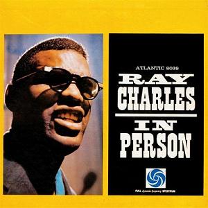
Cover which served as the basis for the layout of the project; album art itself was also made into an icon (top-left).

Kinda cheated with this one. The album cover on the right uses Clarendon, but was a spiritual successor of sorts to the album art on the left when a music label had a resurgence and began to re-distribute albums. However, I thought the composition on the left was a little less cramped and worked better as an icon, so it served as the base (bottom-right).
Final composition:

Wednesday, August 19, 2015
09.01.15 | Shepard Fairey Pleads Guilty In Copyright Case
I really don't think there's a whole lot to say with regards to Fairey's methods and the subsequent response by the Associated Press - if it was just a low-level squabble between AP and a photo protected under Fair Use, there would probably be a larger discussion to be had, e.g. regarding "how far can you go with fair use until it becomes appropriation beyond the legalities associated with the media's original rights," "who truly owns an image that belongs to the creative commons," etc.
However, with Shepard Fairey's highly deliberate torch-and-burn campaign to try and obfuscate the legal missteps he took in order to produce his merchandise, it ultimately stripped him of any rights he may have had regarding the usage of the original photograph. There's a contrarian argument to be made in the hurdles Fairey had to go through just to use a single photograph, but again, he's no entry-level designer; someone so well-versed in production of commercial media should know the repercussions associated with copyright infringement.
However, with Shepard Fairey's highly deliberate torch-and-burn campaign to try and obfuscate the legal missteps he took in order to produce his merchandise, it ultimately stripped him of any rights he may have had regarding the usage of the original photograph. There's a contrarian argument to be made in the hurdles Fairey had to go through just to use a single photograph, but again, he's no entry-level designer; someone so well-versed in production of commercial media should know the repercussions associated with copyright infringement.
Subscribe to:
Comments (Atom)